Angular modules and components
Unit: 14 of 15
Angular applications are made up of different elements. So far, we have already had the opportunity to familiarize ourselves with the principles of components, when we created our first Angular application in the introductory Angular lesson. However, although it is very important, component is only one of the terms used while building Angular applications. Therefore, the next lesson will be dedicated to getting familiar with all the elements that make up the architecture of an Angular application.
Angular application architecture
Every Angular application relies on the structure of certain predefined terms that have a special meaning within the Angular ecosystem. Thus, while using Angular we actually operate with various building blocks, from which such a system is formed (image 14.1.).
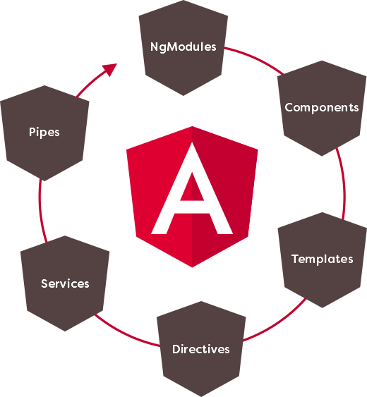
Image 14.1. Angular architecture
Image 14.1. presents the basic building blocks of the Angular architecture. To begin with, we will familiarize ourselves with their principles:
- Angular modules (NgModules) – are basic building blocks for Angular applications; they are used to combine the code into functional units;
- Components – elements that define parts of the user environment of Angular applications; Within Angular components, the styling, presentation and logic of a segment of what the user sees in the web browser are combined;
- Templates – define the presentation of Angular components using a clean HTML code; within the HTML code of the Angular template, many valid HTML creations can be defined, but for Angular they have a special meaning, so that they allow simple interpolation, data binding, code generation, event processing, etc.;
- Directives – directives allow, in addition to data, arbitrary logic to be included in the template, which can influence the way Angular component presentation is created;
- Services – elements for handling data that are shared between several components; services allow certain operations, such as reading data from the server, validating user input, or logging internal application events, to be moved outside of components and then made available to all components that require certain functionality;
- Pipes – elements that allow the easy transformation of data, even before their display in the template of an Angular component; at the same time, the Pipes mechanism allows the source data to remain unchanged and only the user to receive the adapted, i.e. transformed, version.
At the top of the Angular building block hierarchy are:
Angular modules
Familiarization with the Angular notions just presented will begin with a story about the basic elements of such a system – Angular modules. Therefore, Angular applications are made up of modules, of a special type of module that is illustratively called NgModules (of course, the prefix Ng refers to the abbreviation of Angular ) .
Right at the beginning we have to make the difference, i.e. a distinction between ES6 module and NgModule. Both types of modules are used while developing Angular applications, but they have different purposes. We have already familiarized ourselves with the use of ES6 modules in previous lessons, and we can see that they are used to isolate functionality in separate files and to control the sharing of such functionality. NgModules have a slightly different role. They serve as containers for the elements that make up an Angular application or part of it. Thus, within the Angular module, the components, directives, services and other parts of the code are combined, which form a whole (image 14.2.).
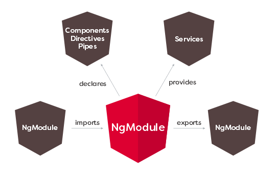
Image 14.2. The notion of NgModule
From Figure 14.2, you can also see that an Angular module can import functionality from another module, but it can also expose its functionality to another module for use, just like ES6 modules.
Every Angular application has at least one NgModule, which is called the root Angular module. In the example of our first Angular application from one of the previous lessons, such a module was automatically created for us when generating the project and placed within a file called app.module.ts :
|
1
2
3
4
5
6
7
8
9
10
11
12
13
14
15
16
|
import { BrowserModule } from '@angular/platform-browser';import { NgModule } from '@angular/core';import { AppComponent } from './app.component';@NgModule({ declarations: [ AppComponent ], imports: [ BrowserModule ], providers: [], bootstrap: [AppComponent]})export class AppModule { } |
Based on the contents of the app.module.ts file , a lot can be inferred about NgModule properties. To begin with, you can see that Angular modules are defined using regular classes, which are decorated with a special @NgModule() decorator . Using such a decorator, the module is configured. An object with metadata about the mode is passed to the function representing the decorator. The most important properties of such a module configuration object are:
- declarations – components, directives and pipes belonging to the module,
- exports – module elements that will be available to other Angular modules,
- imports – modules whose functionalities are used by the elements of the used module;
- providers – services that the module exposes for use,
- bootstrap – the root component of the module used to build and integrate all other components; if an application has multiple Angular modules, only the root module can define this property, to ensure there is a single entry point for the complete application.
Now that we know what different properties are used for configuring a single Angular module, it is not difficult to understand the properties of the Angular module created while building the first project. Such an Angular module:
- declare an Angular component called AppComponent ,
- imports an NgModule named BrowserModule ,
- does not export anything because it is a root module, so there is no module above it that imports such functionality,
- defines a component called AppComponent as a root component of the entire application.
| Built-in Angular modules (Angular libraries)
Angular is a software framework consisting of a multitude of Angular modules that provide a set of built-in functionalities. Thus, during the creation of Angular applications, in addition to the NgModules that we create independently, we also manage the modules that are an integral part of the system. Such built-in modules are otherwise called Angular libraries. Angular libraries are actually npm packages whose names start with the prefix @angular and can be downloaded using the npm package manager. However, we don’t have to do this manually, because within a project created using Angular CLI, all the necessary dependencies are automatically there. However, to use them, we need to import them. Such a situation also exists in the root module of our Angular application. The root module of our application will import an Angular library called BrowserModule . The procedure used for importing illustrates a kind of example of complementarity between ES6 modules and Angular modules. First, the Angular library will be imported as an ES6 module: import { BrowserModule } from ‘@angular/platform-browser’; However, to access BrowserModule functionality from the root Angular module, the name of such a module is set as one of the values of the imports property of the root Angular module configuration object:
|
Angular components
Angular components define a part of the user environment of the Angular application, that is, a part of the display that the user sees in the web browser. Within an Angular component, the presentation logic and the program logic are combined, i.e. all those elements that are necessary to form a display in a web browser.
Angular components are defined as regular classes that are decorated using a special decorator @Component() , which is passed an object with metadata to configure the component. The Angular component created by the Angular CLI tool, during the project generation process, looks like this:
|
1
2
3
4
5
6
7
8
9
10
|
import { Component } from '@angular/core';@Component({ selector: 'app-root', templateUrl: './app.component.html', styleUrls: ['./app.component.css']})export class AppComponent { title = 'my-first-app';} |
Analyzing the displayed code, we can see what I said – the @Component() decorator was placed on the AppComponent class and, on this occasion, it was passed an object to configure the component. The configuration object has the following properties:
- selector – a selector that defines the element, within which the complete presentation of the component will be inserted; in the example app-root is defined , which means that the full presentation of the component will be placed inside the <app-root> </app-root> element,
- templateUrl – the path where the template file is located; in one of the previous lessons you could see that a model can also be defined inside an object to decorate a component; then, instead of the templateUrl property, the template property is used ,
- styleUrls – the path where the file with the code for styling the component is located; and the styling can be defined directly in the file containing the component class and then the styles property is used .
After this brief introduction of the basic properties of Angular components, it can be said that their structure looks like in image 14.3.
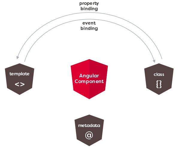
Image 14.3. Structure of the Angular component
In picture 14.3. three basic elements that participate in the creation of Angular components are also presented: the template, the program logic within the class and the metadata for configuring such a component. However, in image 14.3. you can see another very important feature of the component, which is related to data connectivity. This basically means that Angular allows you to bind data directly to a component template and that changes to the data are automatically propagated to the presentation layer. In addition, Angular allows the presentation layer to send component notifications about DOM events that occur during application usage. These two basic types of communication between a component’s logic and its template are illustrated by the arrows at the top of Figure 14.3.
Angular component template
What the user sees when an Angular component is displayed in a web browser is the product of the code found in the component’s template. Angular component templates are created with HTML code, using specific elements that have special meaning to Angular. Such special elements of the Angular template make it possible to:
- interpolation,
- defining expressions,
- unidirectional and bidirectional connection,
- subscription to events,
- modifying the DOM structure using directives,
- transformation of values using Pipes.
Before we start a detailed analysis of all the terms listed, which are specific to building an Angular template, we will look at what a template that is automatically generated for us when we build a project using the Angular CLI tool looks like.
In the example of the first Angular application generated with the Angular CLI, the template is placed within a separate file called app.component.html . If you analyze the content of this file, you will be able to see that it is an HTML code, which also has some elements that we have not encountered before. It is a special Angular syntax for building templates, which influences the display of data and the generation of the presentation. For example, within a file that represents a template, you might find a line like this:
<span>{{ title }} app is running!</span>
This is a line of HTML code that displays a greeting message on the page that is received within a web browser. If you look closely at the contents of this span element, you will notice the use of a specific syntax involving two pairs of braces within which the title text is defined . The text title is actually the name of the variable that is in the class that represents the component. Two pairs of braces represent a specific Angular syntax for doing interpolation .
Such specific Angular creations exist even within the component template. For example, in the Next Steps section , you can find several div elements, whose markup code looks like this:
|
1
2
3
|
<div class="card card-small" (click)="selection.value = 'component'"> <span>New Component</span></div> |
On the displayed div element , you can see how events are subscribed in Angular – the event name ( click ) is set in parentheses and this will record the logic that will be activated when the user clicks on such a div element .
This div element is used to build part of the page which is obtained by generating the project using Angular CLI, which you can see in the following animation.

Animation 14.1. Part of the page, made using the very elements shown
Clicking on one of the items in the Next Steps section automatically changes the content of the terminal below. This behavior is entirely created using specific Angular template elements. You have seen such an element in the previous lines, it refers to subscribing to a click event using the HTML attribute in a specific form – ( click ). As the value of the attribute ( click ), the code that defines the value property of a variable called selection is set:
(click)=”selection.value = ‘component'”
If we take a closer look at our component template, we can see that there is an element like this inside it:
<input type=”hidden” #selection>
Using the # character, a template reference variable was created. This is a specific Angular template functionality that allows you to get a reference to a DOM element directly within the template.
It is now clearer what was achieved earlier by setting the value selection.value – the value of the input element on which the reference variable #selection was defined is set .
Finally, the value entered within the hidden input element by clicking one of the elements is used by the following template logic to generate text within the terminal:
|
1
2
3
4
5
6
7
8
9
|
<!-- Terminal --><div class="terminal" [ngSwitch]="selection.value"> <pre *ngSwitchDefault>ng generate component xyz</pre> <pre *ngSwitchCase="'material'">ng add @angular/material</pre> <pre *ngSwitchCase="'pwa'">ng add @angular/pwa</pre> <pre *ngSwitchCase="'dependency'">ng add _____</pre> <pre *ngSwitchCase="'test'">ng test</pre> <pre *ngSwitchCase="'build'">ng build --prod</pre></div> |
Within this Angular template code, another specific Angular term is used – directive . The directive used in the example shown is called NgSwitch and, as you might guess, is used to dynamically render code based on a condition. The defined condition is the value of the variable selection.value and, depending on the value of such a variable, one of several directives defined in NgSwitchCase is executed . In this way, depending on the value of the variable selection.value , the corresponding code is displayed in the console on the web page, just as shown in animation 14.1.
| Generating a new component and preparing the project for the next lesson
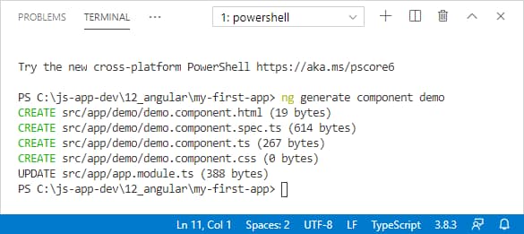
In the previous lines you could see only a small demonstration of the possibilities of the Angular template. We will stop here, and the story about templates and different elements that can be found in them, will be continued in the next lesson. To prepare the working environment for the next lesson, in the following lines we will explain for the first time the independent creation of a component. A new component, using the Angular CLI can be created by issuing the following command: of the generate component demo When you issue such a command, you must be positioned in the root folder of your project or workspace, if it is a single-project workspace (like ours). Successfully generating a new component results in a display like Figure 14.4.
Image 14.4. Generating the new component Generating a new component using Angular CLI involves creating four new files in the folder with the name of the component, in the src/app folder of the project. In addition to creating the component files, Angular CLI does something else for us – it automatically declares the created component in the main application module:
In the declaration section , you can see that in addition to the already present AppComponent , our DemoComponent has now been added . What we want to accomplish next is to completely remove the code that was automatically generated by us by the CLI when creating the project and have the presentation of our Angular application consist entirely of that defined by the newly created component. To perform such an operation, it is enough to remove the entire content from the main component template and replace it with the following: <app-demo></app-demo>
In this way, using Angular, we achieved component composition for the first time, that is, we placed a component within another component. But how did we know that we only need to use such an element to display the Demo component in the main application component? The name of the selector on the basis of which the element within which the presentation of a component will be placed is determined by the selector property , while the decorator configures the component: and
Here you can see that the value of the selector property is exactly app-demo , which is the element type we used to display our component in the main app component. |